Skip to content
Services
Organic Growth
SEO
GEO
Content
Social Media
View all Services
Local Growth
Local SEO
Link Building
Industries
Software (SaaS)
Education
Home Services & Franchises
Healthcare
Consumer Packaged Goods
SEO Packages
Start redefining your site’s performance with our results-driven organic search packages.
One Time Bundle Services
Company
About
Team
Culture
What To Expect
Case Studies
Resources
Blog
SEO
On-Page SEO
Content
Link Building
Local SEO
Social Media
Glossary
Video Library
Services
SEO Packages
All Services
SEO
Local SEO
Content
Social Media
Link Building
Company
About
Team
Culture
What To Expect
Case Studies
Resources
Blog
SEO
On-Page SEO
Content
Link Building
Local SEO
Social Media
Glossary
Video Library
© 2025, Redefine Marketing Group
All rights reserved.
Contact
Back
Blog
Expert Insight from the Redefine Team
Home
Showing 1-9 of 202 results
Categories
Content
Link Building
Local SEO
On-Page SEO
SEO
Social Media
Team
Filters
October 16, 2025
Getting Started with SEO for SaaS and Tech Companies
Read More
October 9, 2025
Beyond Hiring: How to Use LinkedIn for B2B Marketing
Read More
October 2, 2025
8 Business Blogs Crushing It in 2025: Ideas to Inspire Your Content
Read More
September 25, 2025
Share of Search: What It Means & How to Calculate It
Read More
September 18, 2025
9 SEO Tips to Optimize Your Product Description Pages
Read More
September 11, 2025
How to Get More Positive Reviews on Yelp
Read More
September 4, 2025
How To Structure Your SEO Content for AI Search
Read More
August 28, 2025
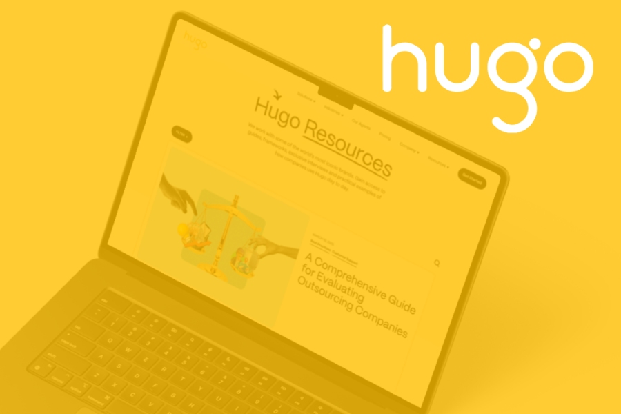
Unlocking Organic Growth with SEO Content Refreshes: Hugo Inc. Case Study
Read More
August 27, 2025
Running List of Google Algorithm Updates
Read More
August 21, 2025
Is Your Website Traffic a Mirage? How to Verify Traffic Authenticity
Read More
1
2
3
...
23